UNIVERSAL PRODUCTION MUSIC
01. DESIGN CHALLENGE
Universal is looking to expand into a younger, more gender- balanced demographic. They are looking for 25-year-olds to think of Universal for their music licensing.
Home to the most innovative composers, songwriters and producers, Universal delivers music that captures passionate audiences the world over.
Universal offers over 2,700 digital albums from more than 37 global libraries. The catalog is continuously evolving with over 100 new albums produced each year.
The goal is to create a 1920 by 1080 animated video matching with a specific piece of audio from their library of music, along with a fake album cover to go along with said track.

02. RESEARCH
With the initial ideations, my concepts were a lot more broad and less focused on the sound of my specific music track. More focused on generally pleasing design approaches, rather than honing in on the sound.
All of them ended up being rejected, as they were too vague and non-specific to the selected track.


TRACK - MASSIVE TEASE

After the first pass, none of the designs were approved. But the general note was to lean into more of that Miami aesthetic, to have the sound be more abstract rather that based around the Universal logo.
03: IDEATIONS
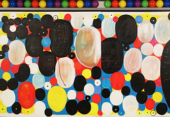
On a redesign, the general note was to further strengthen the inspiration from the Miami Design District and it's different pieces of artwork, both public and retired.
In addition to that, starting my animatic process would give me a better idea of what the overall feeling of the video would be. How it would match the selected track, it's sense of energy, etc.

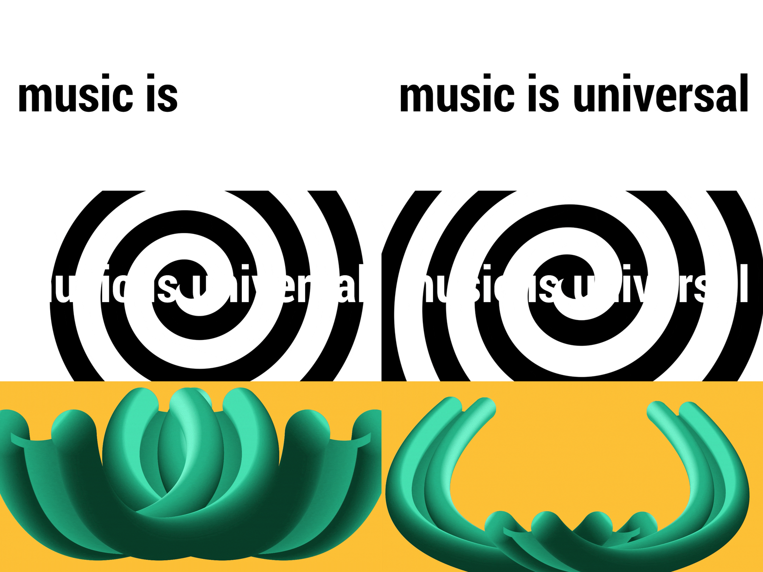
After selected through 15 different pieces, then narrowing it down to 10, was when I hit my stride in simplifying the designs, and having the animation of the video represent transitions. To add to the bouncy and poppy sound of the song, with an exciting and visually exciting animatic.

CHOSEN PIECES:

DOZIE KANU

POETIC INCONGRUITIES

RECLINING MERMAID

FLY'S EYE DOME

VORTEX

With given notes and revisions, the pieces selected and how they were interpreted weren't strong enough. After narrowing the piece collection down to 5, the goal was to simplify the animatic, and how I would end up doing the final animation. Rather than the more time-consuming and specific frame-by-frame animation, the more efficient use of Adobe After Effects would be more effective.
04: DEVELOPMENT
ANIMATION FIRST PASS
After the animatic was looked over and directions were given, the animation process began. With a focus on using many graphic match cuts and different animated techniques that could be done within After Effects.
After this initial pass, the notes catered to the idea of making sure that the different compositions would transition into another in subtle ways.

AFTER EFFECTS FILE LAYOUT

COVER FIRST PASS:

ANIMATION SECOND PASS
After the second pass, I took the final days working on the project to finesse and touch up any minor details within this animation. With the due date being, October 4th, it gave me the opportunity to up the contrast of the final animation, edit down the timing, etc.

05: FINAL RESULTS
ANIMATION FINAL PASS / ONLINE MOCK-UP/ FAKE ALBUM COVER:


