Project Brief
Universal is looking to expand into a younger, more gender- balanced demographic. They are looking for 25-year-olds to think of Universal for their music licensing.
Universal Production Music
Home to the most innovative composers, songwriters and producers, Universal delivers music that captures passionate audiences the world over.
Universal offers over 2,700 digital albums from more than 37 global libraries. The catalog is continuously evolving with over 100 new albums produced each year.
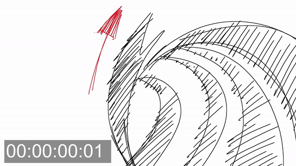
Design Approach 01:
Sketching Success
A purposefully sketchy-looking animation that collectively gets brighter and more vibrant looking at it goes on.
More filled in with saturated colors, with more completed looking animation filling the screen until it culminates in the Universal Production Music logo.

Design Approach 02:
Crumpled Up Fun
A mixed media like animation that utilizes real life photography of different hands picking up different pieces of vector shapes.
Akin to the ensemble story archetype, it would be revealed at the end to be the Universal Production Music logo.

Design Approach 03:
Poppy Grooves
A rotoscoped animation of a person dancing along to the selected track, with different colorful backgrounds.
All ending in the universal production music logo being behind the funky beats along!

After the first pass, none of the designs were approved. But the general note was to lean into more of that Miami aesthetic, to have the sound be more abstract rather that based around the Universal logo.

On my second attempt on a design approach, the general note was to further strengthen the inspiration from the Miami Design District and it's different pieces of artwork, both public and retired.
In addition to that, starting my animatic process would give me a better idea of what the overall feeling of the video would be. How it would match the selected track, it's sense of energy, etc.
With given notes and revisions, the piece selected and how they were interpreted wasn't strong. In addition to that, the two style frames shown off were week in terms of how they connected to the art pieces, and too chaotic in terms of color.


After a second revision, the energy was feeling a lot better, but the overall approach to the animation was changed to be more focused on animation done within Adobe After Effects, rather than more frame-by-frame animation done within Adobe Photoshop.

As the First Pass of official animation started off, the general notes was to lean into the colors of the artwork chosen, and to focus on a stronger sense of flow and cinematic language.
